
Pages
Details
Stakeholder: Vkino - movie posters, online ticketing, seat reservations, sales of related products (3D glasses, popcorn, etc.). The service serves more than 70 cinemas in Ukraine, aggregating the repertoire into a common poster, and providing online ticketing and booking services.
Role: Product designer
Team: Product owner, Product designers
Project type: e-commerce, business automation
Problem:
> 40% of users do not complete ticket orders
> 5% of users request refunds
> 12% of users contact support with problems
Task:
Develop a user-friendly interface for both mobile devices and desktops. Make the customer's path to tickets obvious. Shorten and simplify this path.
Problems may arise at the payment stage (both on the part of the bank and the cinema), so We need to clearly inform the customer about the progress and status of their purchase.
Solve the problem with unfinished orders. Find the reason and solution for why users ask for a refund. Reduce the number of support requests with a clear interface.
Business gains: Expansion of the cinema network, new customers, new business partners, increased monetization
Key result: Increase the conversion of purchased tickets, reduce the number of errors when booking tickets, reduction in the number of negative reviews (based on satisfaction surveys)
Challenge
In the beginning, we created uniform websites with a poster and online purchase for each cinema. As the number of customers grew, this model became inconvenient to maintain and add new features. We developed a widget website that had to integrate with minimal effort into existing cinema websites. Depending on the configuration, different functions and basic styling were available. But over time, most of our clients developed their own sites to their liking, which had their own posters. There was a need to separate session selection and purchase (and everything related to it). That's how our own poster (vkino.com.ua) and customer account (bilet.vkino.com.ua) appeared.
The main problem is that the widget site has ceased to be a part of other sites (a site within a site). However, the interface has remained almost unchanged, in fact, what used to open in a window and had limited screen space is now displayed as a separate page.
The interface is too large for mobile devices and too small for desktops, there is no adaptive layout. Pop-up windows are used to move from one stage to another, which results in inefficient use of the screen.
We needed to make it obvious to the customer how to get tickets. Shorten and simplify this path.
Stakeholder brief
Learned more about the requirements, existing problems, and possible preliminary solutions to avoid repeating the same mistakes.
Thoughts
The site provides aggregation services for non-network cinemas
The site has a direct user journey
Has an outdated approach to user experience that slows down the user or forces them to close the site
The site has problems with mobile responsiveness
Monetization - a percentage of the ticket sold in the cinema (customers)
Insights
The service serves more than 70 cinemas in Ukraine. We aggregate the repertoire into a common poster and provide online ticketing and booking services.
Main tasks of the site: Selection of a movie, a session by various criteria, online purchase.
Task: develop a user-friendly interface for both mobile devices and desktops. Make the customer's path to tickets obvious. Shorten and simplify this path.
There may be problems at the payment stage (both on the part of the bank and the cinema), so we need to clearly inform the customer about the progress and status of their purchase.
Field of activity: e-commerce, business automation
Target audience: Everyone who goes to the movies, 13+
Problem: The interface is too big for mobile devices and too small for desktops, and there is no adaptive layout. Pop-ups are used to move from one stage to another, which results in inefficient use of the screen.
Products and services provided: Movie posters, online ticketing, seat reservations, sale of related products (3D glasses, popcorn, etc.)
Restrictions: sales and reservations are made only for authorized customers. We currently use authorization by social networks and with a one-time password on
Let's check the analytics
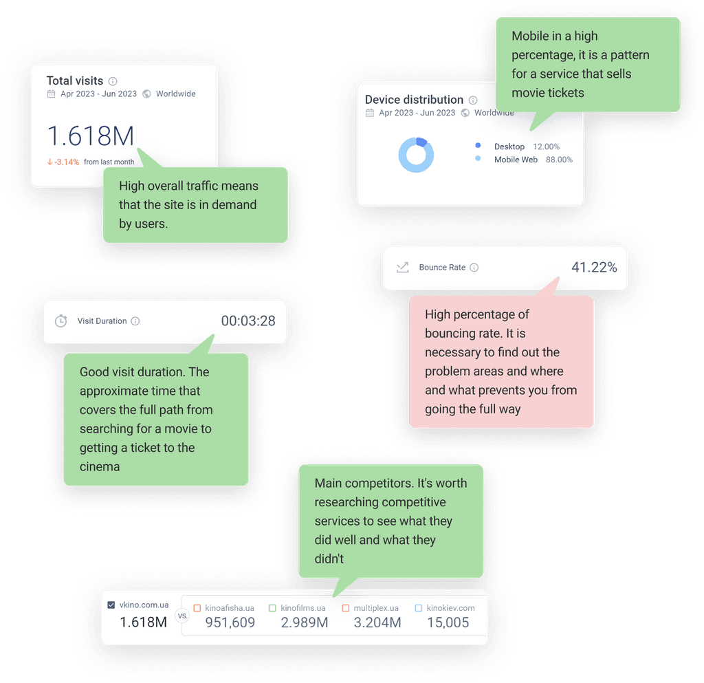
Aditional thoughts
Advertising either does not show or there are no
Why research?

Competitor research
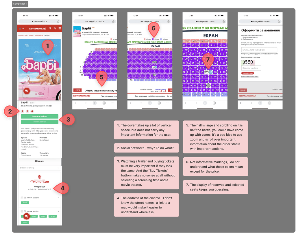
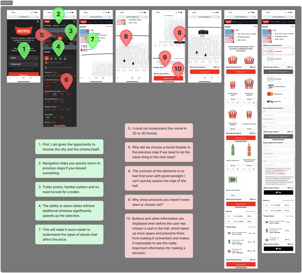
User interviews
We conduct qualitative research with users to identify problem areas and possible needs, which will give us an understanding of what solutions can be applied to increase conversion.To form a vision of what Vkino could be, We started with a deep generative research. We set out to answer the question "What can Vkino do to make the customer's path to tickets obvious, shorten and simplify it?" We conducted in-depth research with competitors' users and users of our service to learn more about their experiences and interactions.
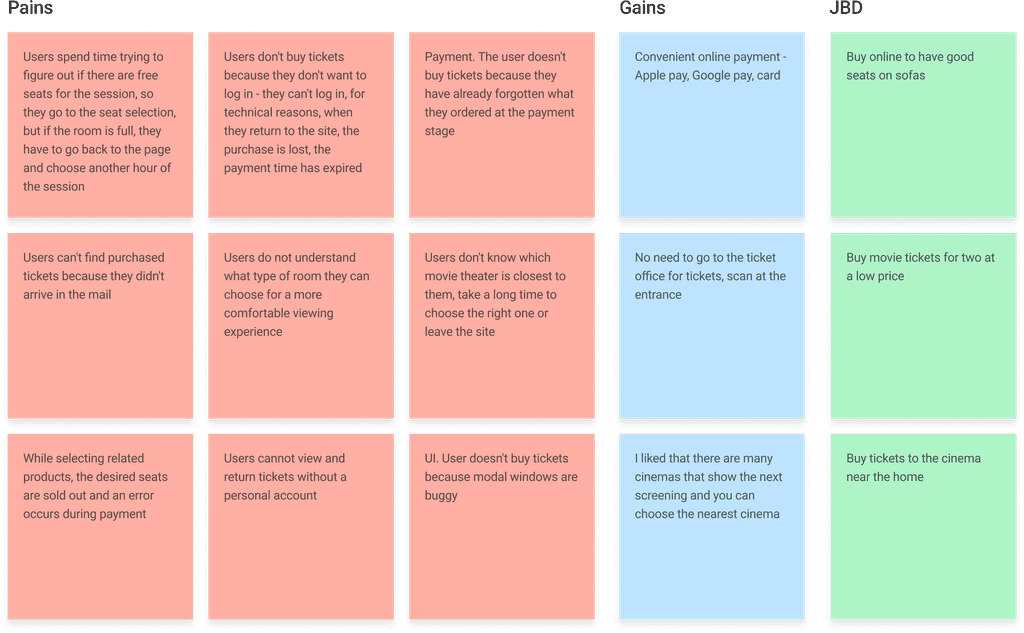
User persona
Past negative experience:
The payment for the ticket failed, and when I returned to the site screen, the selected tickets were canceled. By the time I selected the tickets, they had already been bought.
The geolocation is often incorrectly determined. Slow authorization
Past positive experience:
Quick to pay
Convenient to save tickets
Promotions, discounts, loyalty program
Price
What is important when she buys tickets:
Seats in the center, comfortable seats
Information about the type of hall(Comfortable hall)
Information about the seats
Convenient payment
Transport accessibility of the cinema
Convenient session time
How to find out about a movie
Looking for a movie by name on Google
Wants to buy tickets in a specific movie theater
Customer Journey Map
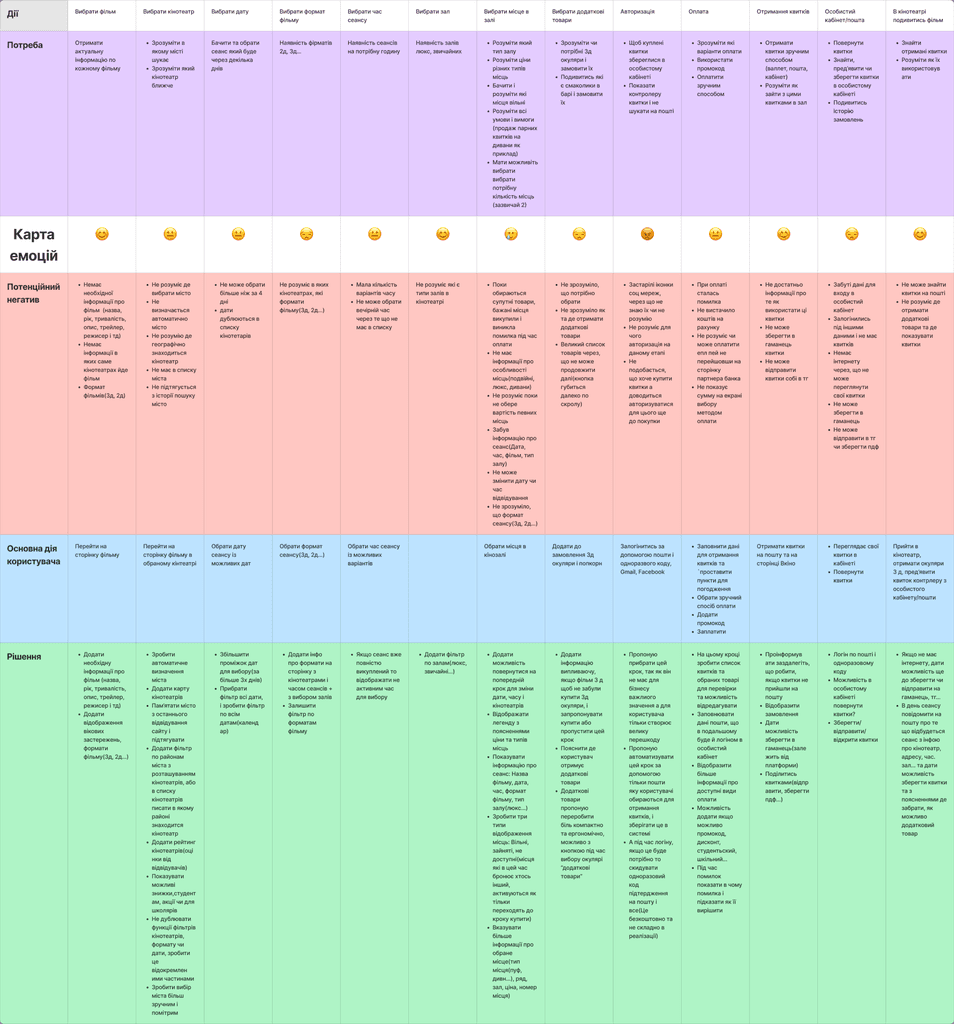
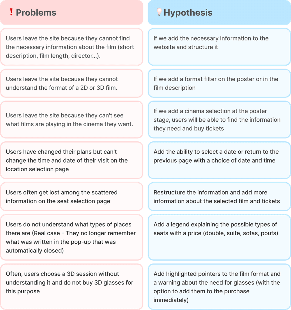
Based on the CJM, we identified the most problematic places in the user journey, which could hypothetically prevent users from completing the full ticketing path. The main problems that users most often face and why most of them left the service:
Selecting a session date, which was previously complicated and duplicated on the same page, leading to user confusion
The type of seats in the hall is not clear, prices are different, but the seats look the same
Early display of warning windows that had outdated information, which led to distraction from the main action
Not all users realized that they needed to buy 3D glasses to watch a movie
Mandatory login for purchase, which is the most emotionally vulnerable point for users.
After receiving tickets, it is impossible to share them and users cannot remember which email they received the tickets to
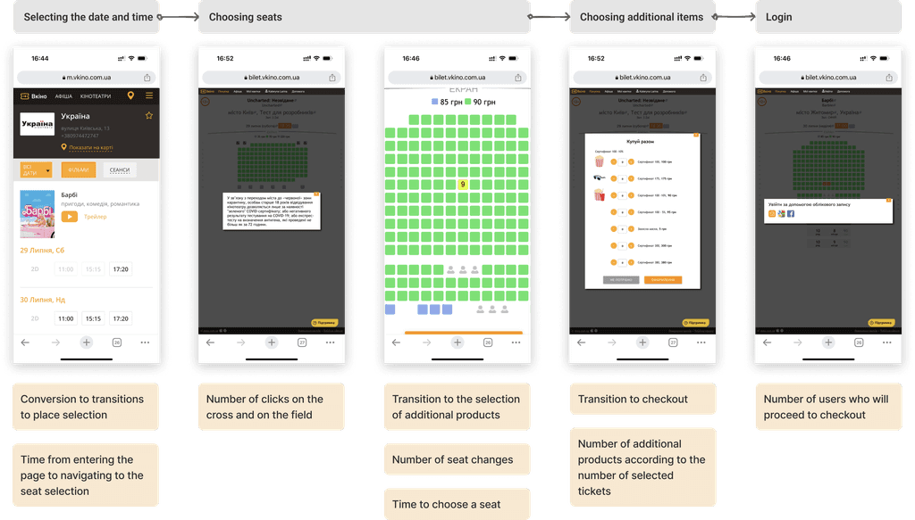
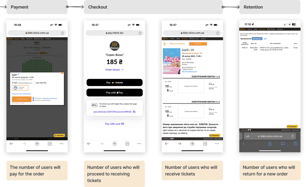
Metrics
We have built a map of metrics. This will help us understand which metrics we need to track and which ones we have influenced.
Ideation process
Our research findings, stakeholder insights, and user feedback, have led to the compilation of issues and potential solutions. The general consensus was to simplify and clarify the interface via detailed explanations. It was also noted that function repetition in the interface was an issue, hence the proposal was to eliminate the redundant and retain the essentials. This move would streamline the ticket ordering process which was previously fraught with complications. Furthermore, the intention was also to design a user-friendly sequence for ticket purchases.
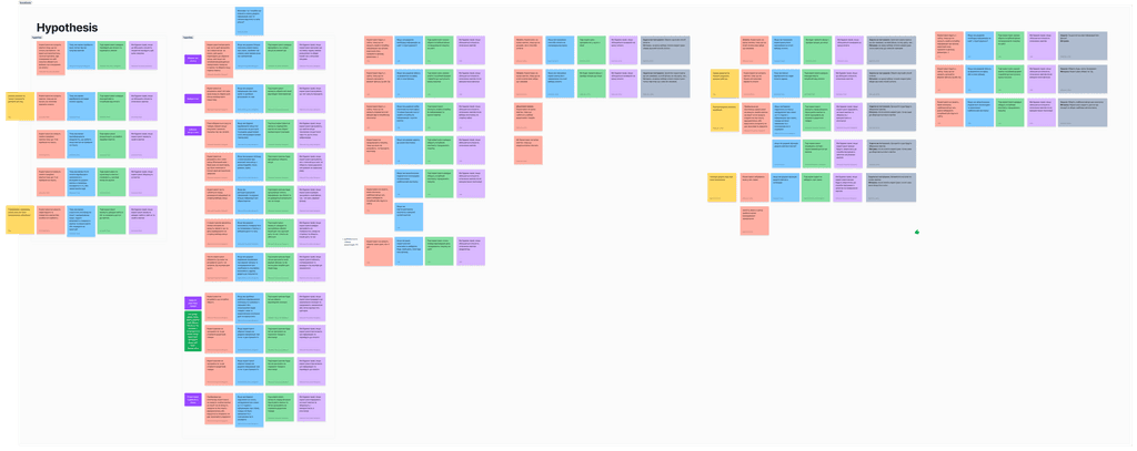
After analysing all the hypotheses, we filtered them by business impact, user impact, technical and time feasibility.
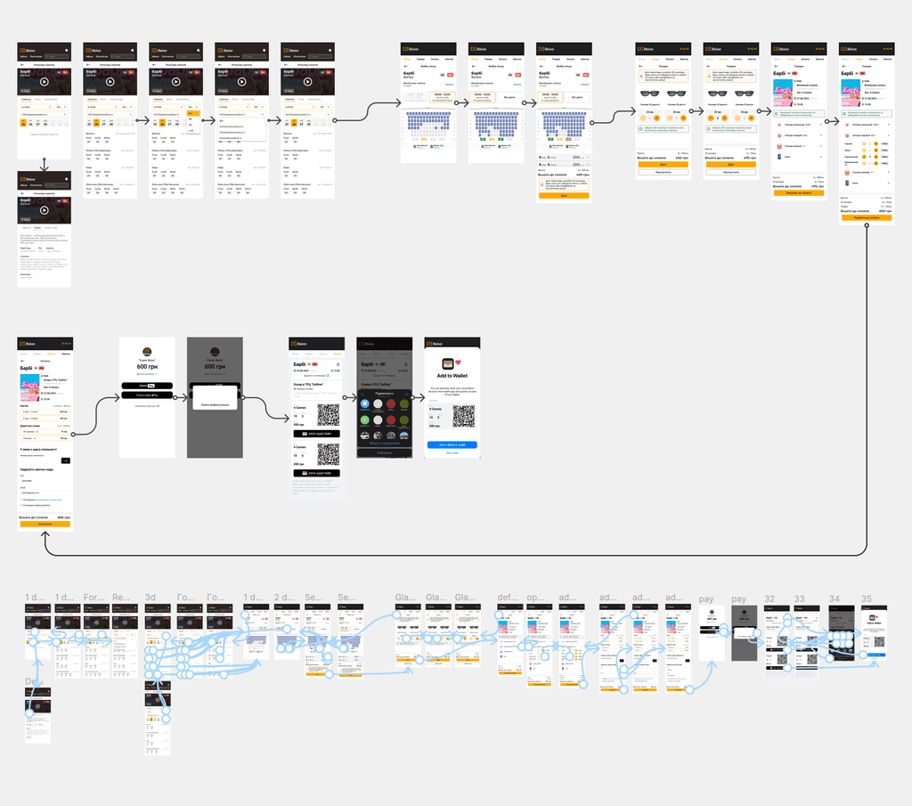
Prototyping
Usability testing
Inspired by the concepts, we designed a model and set tasks for user experimentation. To decipher the feasibility of our assumptions, we constructed an archetype to further explore user experiences, invited participants to discourse, and initiated user validation of our hyphotesis.
Executive summary
Our research and tested ideas were presented to the customer. After that, we discussed technical issues with the development team. We prioritised and drew up a roadmap with the product manager. Thanks to this, we got the green light to implement the ideas for the new product redesign in stages.
Go to the next project
KOZYNSKYI OLEKSANDR


